You are here
Energy
01.25.2014
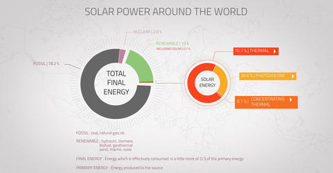
An interactive data visualization to understand the share of solar energy in the global energy mix.
12.03.2013
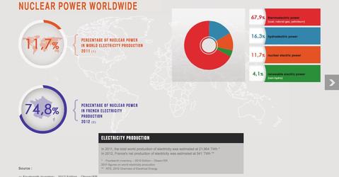
What is the real weight of nuclear power in total global electricity output? Which countries produce uranium? Those which house the largest number of power plants or which are currently building new...


